Original article posted on the Jungle Minds website
They fold, roll, slide, twist, bend and swivel, but how will the web hold up?
February 2021
Exploring what impact ‘moving screens’ might have on the flexibility of the web
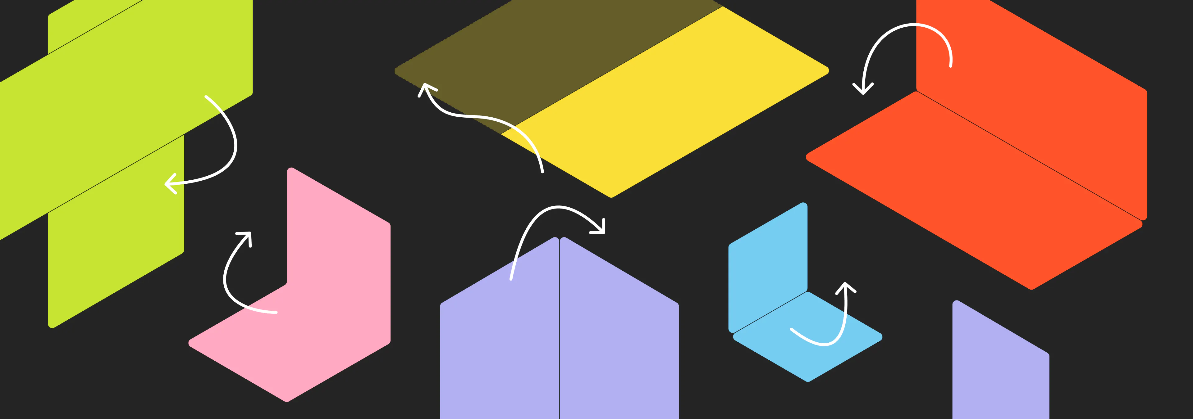
The Samsung Galaxy Z Flip, the Galaxy Z Fold 2, the LG Wing, the Motorola Razr, the Microsoft Surface Duo, the LG Dual Screen G8X ThinQ and the Huawei Mate Xs 5G are all recent smartphones that have one thing in common; they all have screens that can do stuff. They can either fold, roll, slide, twist, bend or swivel. This new development in the smartphone industry intrigues me as a User Experience Designer at Jungle Minds. Why? Because it can bring new challenges and opportunities to how websites are being displayed and possibly even how they will be used. I think the story of these ‘moving screens’ starts with taking a look at the term responsive design.
XS,S,M,L,XL
When it comes to responsive (web)design, a lot of times we talk about designing for a couple of different screen sizes and breakpoints. For instance a width of 320px, 768px, 1024px, 1280px and so on. But there is a whole range of screen sizes, the spectrum increasing every new generation, each with their own specifications that add extra dimensions to the landscape. There is pixel density, the input method and there’s the physical screen size and the viewing distance to the device. If we purely look at the different screen resolutions (in points) for iPhones, starting from the 2016 iPhone SE, that is already a list of seven, not taking into account the difference in pixel density, rendering size or physical screen size.
- iPhone 12 Pro Max - 428 x 926 pt
- iPhone 11 Pro Max / iPhone 11 / iPhon Xs Max / iPhone Xr - 414 x 896 pt
- iPhone 8 Plus / iPhone 7 Plus / iPhone 6s Plus / iPhone 6 Plus- 414 x 736 pt
- iPhone 12 Pro / iPhone 12 - 390 x 844 pt
- iPhone 12 mini / iPhone 11 Pro / iPhone Xs / iPhone X - 375 x 812 pt
- iPhone 8 / iPhone 7 / iPhone 6s / iPhone 6 / 2020 iPhone SE - 375 x 667 pt
- 2016 iPhone SE - 320 x 568 pt
And that's just iPhone. Then there is Android devices, tablets, laptops and monitors, smartwatches, consoles and TV’s. Listing all these different screen sizes and their specifications is not something I want to go into. But this introduction is here to, well, introduce something. Which is; the landscape of screen-, window- and device sizes has become so complex, that it would be madness to design for all these different devices.
"Responsive design has to be about the inherent flexibility of elements, pages and text sizes, more than about screen sizes."
So let’s explore what those moving screens can bring (or break) to responsive design
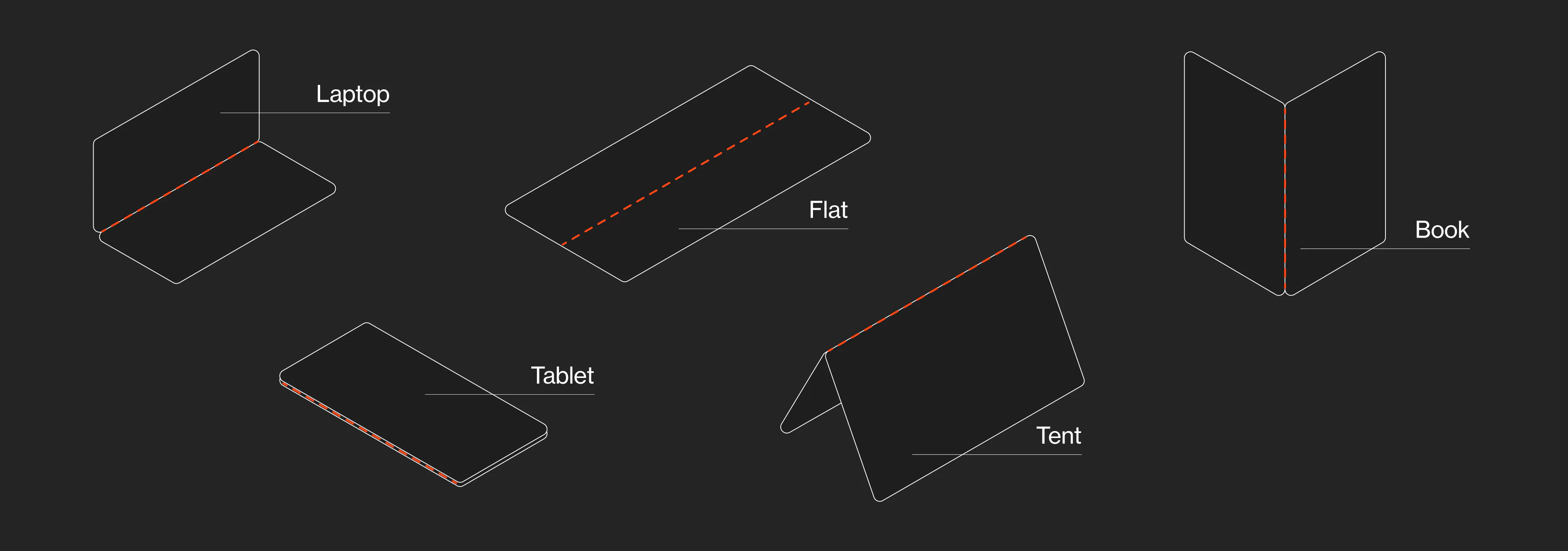
Screens of devices on the market at the time of writing, mainly fold and unfold. Such as the Samsung Galaxy Z Flip and the Galaxy Z Fold 2. This folding and unfolding is used in some different ways resulting in different orientations that a device can have. For example the tablet, laptop or tent oreintation, as illustrated below.
I’m assuming that not a lot of people resize their browser windows or switch their phone a lot from portrait to landscape very frequently. But with these new screen orientations, we will probably see changes of window and browser size more frequently. When you fold your screen in half a couple of times a day, you want to see what’s happening and not feel lost every time you do this. There’s small things to keep in mind, such as making sure that the scroll position is remembered. But if changing orientation is indeed becoming everyday practice, it will be interesting to look at how a page transitions from one orientation to another. By perhaps using small animations to indicate how an element changes, or where it went to.
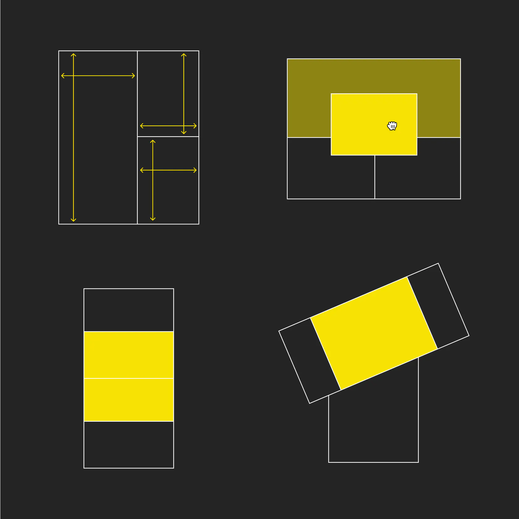
Pages will need to adapt not only to screen width, but also height and the combination of those two. For example on the Samsung Galaxy Fold, when having three windows open in multitask mode (in landscape), the browser window is 85 pixels high. This means that on a lot of websites, it might show no more than the hamburger menu icon and your logo. Now, this is a bit of an extreme example and yes, of course, people can resize their browser window to these same dimensions on their computer. But when your device encourages multitasking and the screen can change depending on the way you hold it, these things just sort of happen.
There’s already some initiatives for trying to standardize the way pages would react. Mircosoft has their Web API's for Dual Screen and Foldable Devices. And there’s of course community driven initiatives. But it feels to me that there can be something more fundamental to this. Which I hope will be the inherent flexibility of the web. No longer needing to define breakpoints (or will it be foldpoints?). Moving away from using pixels to scale towards using units such as EM’s, precentages or viewport-height and -width. Hopefully design tools will move in this direction as well, so that we start designing in a way that is flexible in it’s core, rather than relying on baind-aid solutions that get ripped apart when folding the web.